Before we could access the internet on our smartphones and tablets, things were easier. In order to have an online presence, a website had to be designed with a desktop and possibly a laptop in mind. These days, however, a wide range of screen sizes must be taken into account and supported, from larger desktop and laptop screens to smaller mobile phone and tablet screens. This is especially important because users will quickly navigate away from a webpage if it doesn’t display correctly on their chosen screen.
Responsive design and adaptive design are the two ways to make sure a website is optimized for screens on smartphones, tablets, laptops, and PCs. Although they both aim to address the same issue, they employ distinct approaches.
Responsive Web Design
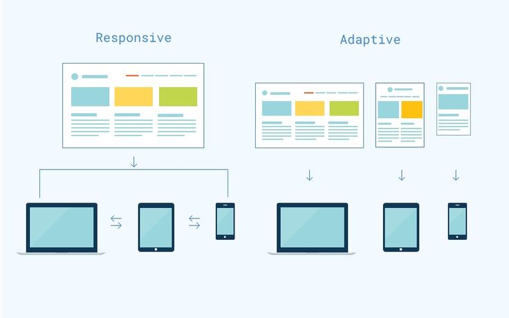
Responsive web design is a web design approach that uses flexible grids, images, and media queries to adapt the content and design to the available screen space. It uses a single layout and code for all devices. A responsive website could, for example, have a hamburger icon on a smartphone, a vertical menu on a tablet, and a horizontal menu on a desktop. Because of its many benefits, Responsive web design is frequently regarded as the accepted and advised approach for mobile web design practice. It is easier to maintain and update, cost-effective and time-efficient, user-friendly and accessible, as well as SEO-friendly. It avoids duplicate content and improves loading speed and performance.
Adaptive Web Design
Adaptive Web Design is a web design technique that uses multiple layouts and multiple sets of code for different devices. It detects the device type and screen size of the user and delivers the most suitable version of the website, for example, an adaptive website might have six different layouts. Adaptive Web Design offers various advantages such as allowing more customization and control over the design and functionality of each version, enhancing user experience by providing device-specific features and content, improving loading speed and performance by reducing unnecessary data, and catering to older or less common devices that may not support Responsive web design.
What’s the Difference between Adaptive and Responsive Design?
The primary difference between adaptive and responsive design lies in how they adapt to different screen sizes and devices.
Adaptive Web Design:
– Involves creating specific layouts for predetermined screen sizes.
– Targets specific device breakpoints with fixed layout sizes.
– Allows for more fine-tuned control over the user experience on certain devices.
Responsive Web Design:
– Uses a fluid grid system to adapt to various screen sizes.
– Provides a flexible and consistent user experience across devices.
– Adapts to any screen size without the need for multiple layouts.
While both approaches aim to optimize the user experience across devices, they employ different methods to achieve this goal.
How to Choose Between Responsive Web Design and Adaptive Web Design?
There is no one-size-fits-all solution when it comes to selecting the web design technique that will work best for your mobile marketing strategy. Along with your business objectives and budget, you should also take your target audience’s preferences, behaviors, and needs into account. In addition, your technical abilities and resources should be considered, as well as the content, structure, and complexity of your website. It’s crucial to consider the benefits and drawbacks of each choice in light of your unique circumstances and objectives. Additionally, it’s critical to test and assess your website across a range of platforms and browsers to make sure it functions properly and lives up to user expectations.
Which Web Design Best Practices are Responsive Web Design and Adaptive Web Design?
Regardless of the web design approach you select, there are best practices to remember to maximize your mobile website’s performance and improve your mobile marketing outcomes. Design your website for the smallest screen size first, then scale it up for larger devices, by starting with a mobile-first strategy. This will assist you in concentrating on the features and content that are most crucial and pertinent to your users. Additionally, make use of responsive and adaptive images that are suitable for the device and screen size of your users, as well as straightforward, visible, and intuitive navigation. Fonts ought to be readable and recognizable, with size and spacing adjusted to fit the available area. Lastly, avoid using elements that are difficult or impossible to use with touch and instead use touch-friendly elements that are appropriate for touch-based interactions on mobile devices.
What’s the Best Choice for Designers?
Responsive design and adaptive design both aim to optimize the user experience across different devices, but they approach this in different ways. Responsive design uses a fluid grid system to ensure that a website or application adapts to different screen sizes and orientations. It provides a more flexible and consistent user experience across various devices. Adaptive design, on the other hand, involves creating multiple fixed layout sizes to target specific device breakpoints. This means that the website or application is designed to adapt to predetermined screen sizes. The best choice for designers depends on various factors such as the project requirements, target audience, and the resources available. Responsive design is often preferred for its flexibility and future-proofing, as it can adapt to new devices without needing major adjustments. Adaptive design, however, allows for more fine-tuned control over the user experience on specific devices. In conclusion, while both approaches have their merits, responsive design is generally considered the best choice for designers due to its flexibility and adaptability across a wide range of devices and screen sizes.
Conclusion
In conclusion, the best choice between responsive design and adaptive design for designers depends on the specific project requirements, target audience, available resources, and the desired level of control over the user experience. While responsive design offers flexibility and future-proofing across a wide range of devices, adaptive design allows for more fine-tuned control over the user experience on specific devices. Designers should carefully assess these factors to determine the most suitable approach for their design needs.