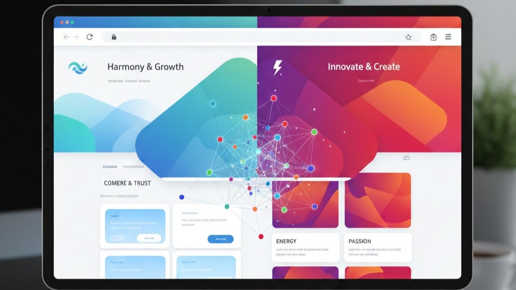
Color psychology plays a powerful role in modern web design because every color influences how users feel and react. Businesses today rely on strategic color choices to build trust, improve branding, and guide user actions. Effective use of color supports clarity, boosts emotional connection, and strengthens the overall experience. Web designers use color combinations to match a brand’s personality and communicate its message clearly. The right palette helps users understand what to focus on as they explore a website. Color psychology remains a core element in shaping strong visual identities.

How Do Colors Affect User Emotions in Web Design?
Colors affect user emotions by triggering psychological responses that shape their browsing experience. Warm colors often create excitement and energy, encouraging users to feel motivated as they interact with the page. Soft colors help build a calming environment that makes users feel safe and comfortable. Bold contrasts guide their attention and influence where they look first. Since emotional impact happens instantly, color choices can strengthen the brand’s message. Emotional design helps users connect strongly with your website.
Different industries use emotional color strategies to match their audience expectations. A healthcare website favors blues because they represent trust and reliability. Creative brands may use more vibrant tones to express innovation and confidence. Luxury brands rely on black, gold, or deep tones to highlight exclusivity. Eco-friendly businesses prefer green hues because they symbolize nature and balance. A well-planned palette helps users feel aligned with your brand values.
Why Is Color Consistency Important for Branding in Web Design?
Color consistency strengthens branding by creating a familiar visual identity for users. When visitors see the same palette across pages, it becomes easier for them to recognize your business. Consistent tones also support a smooth and unified experience that keeps users engaged longer. This consistency helps reduce confusion during navigation because the interface looks predictable. Repetition of brand colors improves memory retention and trust. A consistent color system lays the foundation for strong branding.
Brands benefit more when color consistency aligns with their core message. A professional service provider often chooses clean, simple palettes to show reliability and expertise. A youthful brand may lean into bright and energetic colors to express creativity. A financial company uses stable hues to reinforce responsibility and safety. Keeping the palette consistent across all digital channels increases brand recognition in competitive markets. Consistency builds the credibility users expect from a professional brand.
How Do Designers Use Color Psychology to Improve Website Conversions?
Designers use color psychology to guide user actions and increase conversion rates effectively. Call-to-action buttons often use contrasting colors to stand out clearly. Bright or high-impact tones encourage users to click and explore more. Subtle background colors make the main elements easier to identify. When the visual hierarchy is clear, users feel more confident about their choices. Good color planning helps simplify the user journey.
Conversion-focused color strategies also rely on strong accessibility practices. Designers use combinations that are visually clear for all users, including those with vision limitations. High contrast ratios help important elements remain readable across devices. Simple palettes reduce distractions and keep users focused on what matters. Functional color choices support a logical flow from one step to the next. This approach helps improve both usability and conversion.
What Are the Best Practices for Choosing the Right Color Palette in Web Design?
Visual hierarchy helps users understand which content is most important. Grids make it easier to apply hierarchy by organizing information clearly. You can guide attention using size, color, and spacing differences. Headlines should stand out, while secondary text supports the main message. A clear hierarchy keeps users engaged and reduces bounce rates. It also improves the overall communication of your website.
Experiment with bold typography and contrasting colors to highlight key elements. Make sure important content appears above the fold for better visibility. Use grid alignment to keep visual balance while emphasizing certain areas. Avoid clutter that competes for attention on the same page. The right hierarchy improves readability and navigation flow. Grids ensure that hierarchy is consistent across all sections of your website.

How to Apply Color Psychology Effectively in Web Design ?
To apply color psychology effectively in modern web design, focus on these key practices:
-
Choose a primary brand color that reflects your identity and user expectations.
-
Add secondary colors to support the main palette and build visual depth.
-
Use intentional contrast to highlight buttons and important elements.
-
Maintain consistency across all pages to build stronger recognition.
-
Test multiple palette variations to find the most user-friendly combination.
-
Ensure accessibility by using color ratios that support readability.
Why Neutral Colors Play an Important Role in Modern Web Design?
Neutral colors are a major part of modern web design because they offer balance and clarity. They make vibrant elements stand out while maintaining a clean, professional appearance. Neutral backgrounds create space for important visuals to grab attention naturally. They help keep the interface organized and easy to navigate. Designers rely on neutral tones to reduce visual noise. Neutral colors help maintain strong structure in every layout.
Neutral tones also work well with different branding styles. Businesses with bold branding benefit from using neutrals to avoid overwhelming the user. Minimalist brands use them to create calm, simple experiences. Corporate websites appreciate neutral palettes for their professional and trustworthy feel. These tones adapt well to different industries and audiences. A strong combination of neutrals and accents enhances modern web design.
Conclusion
Color psychology shapes how users feel, behave, and trust your website. When used correctly, colors improve brand identity, guide interactions, and create a positive emotional experience. Modern web design relies on thoughtful color decisions that align with user expectations and business goals. Understanding color psychology helps you build a website that feels professional, consistent, and visually engaging.
Want to enhance your website with professional web design solutions? Contact us today and let’s build a stunning, color-driven design together.