
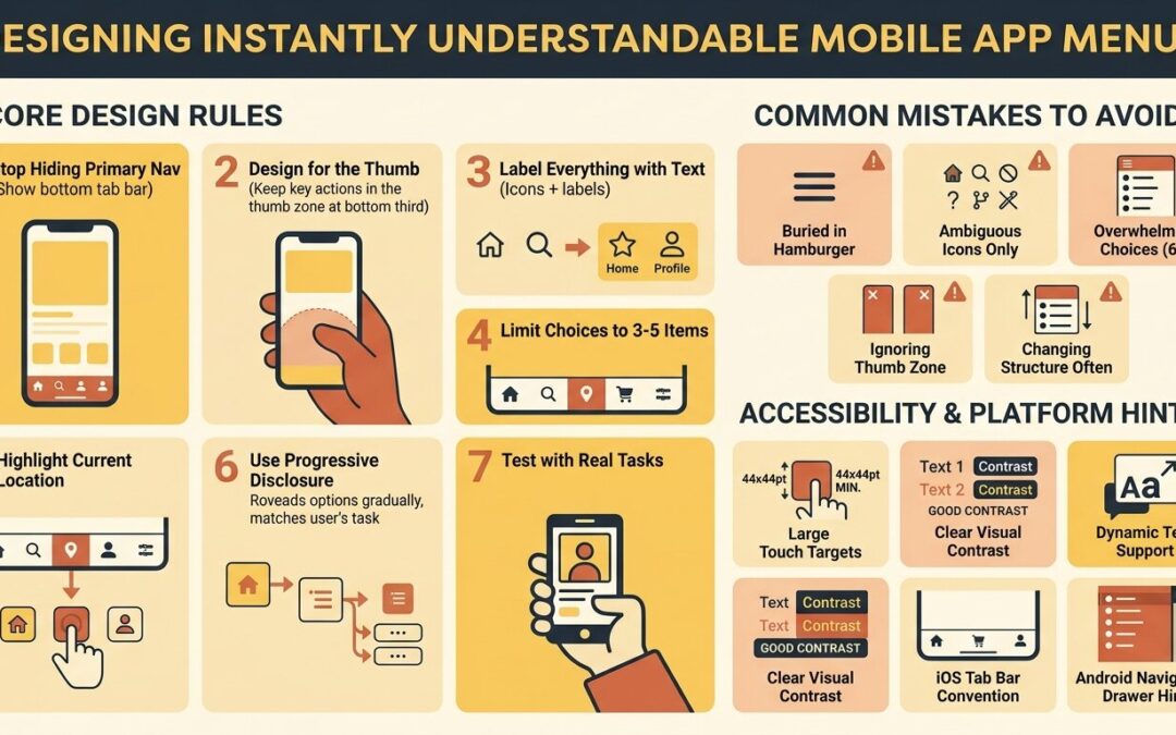
Users do not read menus. They scan, guess, and tap. If your navigation forces them to think, they will swipe back, close the app, and open a competitor’s instead. The difference between a menu that feels invisible and one that feels like a puzzle comes down to how well it matches the way human brains process spatial information on a small screen.
Consider how you personally behave when opening a new app. You rarely study the interface. You glance at it for a second or two, form an instant judgment, and start tapping. If the first tap leads somewhere unexpected, your trust drops. If the second tap also fails, you leave. This entire sequence happens in under ten seconds. Your users behave exactly the same way, which means your navigation has to communicate faster than conscious thought.
This article breaks down seven design rules rooted in cognitive psychology and real-world mobile behavior. Each rule targets a specific reason users get lost, and each one can be applied without a full redesign.
Rule 1: Stop Hiding Your Primary Navigation
The hamburger menu was once treated as a universal solution. In practice, it buries your most important destinations behind a tap that users frequently ignore. Research consistently shows that hiding primary navigation reduces feature discovery and engagement. Users do not explore hidden menus out of curiosity. They assume what they see is what the app offers.
What works instead:
- A bottom tab bar for three to five core destinations
- A persistent top bar for contextual actions within a section
- A visible “More” tab rather than a mysterious three-line icon
Reserve hidden menus for secondary or rarely used settings. If a feature drives revenue or retention, it should not live behind a gesture.
Rule 2: Design for the Thumb, Not the Eye
Most users hold their phone one-handed. The natural sweep of the thumb covers the bottom third of the screen comfortably. The top corners require a grip adjustment that causes drops and mis-taps. This is not a minor ergonomic detail. It directly shapes which parts of your interface get used and which get ignored.
Practical application:
- Place primary navigation in the bottom third
- Keep destructive actions away from the thumb’s resting zone to prevent accidental taps
- Put search and profile access within easy reach
- Avoid stacking critical controls in the top-right corner
Designers often work on large desktop monitors where everything is reachable with a mouse. Users work on a five-inch screen while walking, holding a coffee, or riding a train.
Rule 3: Label Everything Until Users Prove They Don’t Need Labels
Icon-only navigation is elegant in portfolios and confusing in practice. A magnifying glass means search, but a star could mean favorites, ratings, saved items, or featured content. Ambiguity forces users to tap and check, which adds friction. Every unnecessary tap is a small tax on patience.
Guidelines:
- Pair every icon with a short text label in the primary navigation
- Use icon-only treatment only for universally understood symbols like back arrows or close buttons
- Test icon comprehension with real users before removing labels
- Keep labels to one or two words
Some of the most successful apps in the world use labeled navigation bars, not because they lack design sophistication, but because they prioritize comprehension over aesthetics.
Rule 4: Limit Top-Level Choices to Five
Cognitive load research suggests people can hold roughly five to seven items in working memory at once. Mobile menus push this limit further because users are often distracted, moving, or multitasking. Each additional top-level option increases decision time and the likelihood of a wrong tap.
How to stay within the limit:
- Group related features under a single parent category
- Move account settings, legal pages, and help content into a secondary layer
- Use progressive disclosure for advanced options
- Merge overlapping destinations instead of creating new tabs
If your tab bar has six or more items, users will hesitate. Hesitation is the enemy of instant understanding. When teams insist that every feature deserves equal visibility, the result is usually a menu where nothing stands out.
Rule 5: Make Current Location Obvious
Wayfinding is not just about getting somewhere. It is about knowing where you already are. Users who cannot identify their current section will tap randomly to orient themselves. This behavior, sometimes called “navigation thrashing,” is a clear sign that your visual hierarchy is failing.
Design signals that work:
- Highlight the active tab with color, weight, or a filled icon state
- Show a clear page title at the top of each screen
- Use breadcrumbs in deeply nested flows
- Animate transitions so the spatial relationship between screens is visible
Consistency matters more than style here. Pick one active-state treatment and apply it everywhere.
Rule 6: Use Progressive Disclosure Instead of Dumping Everything
A menu that shows every option at once feels comprehensive to the designer and overwhelming to the user. Progressive disclosure reveals complexity gradually, matching the user’s current task. It respects the fact that most people only need a small subset of features at any given moment.
Ways to implement it:
- A bottom sheet that expands to show filters or sub-actions
- A “See all” link that opens a full category list
- Contextual menus that appear only when relevant
- Onboarding that introduces advanced navigation after the first session
The goal is not to hide features. It is to present them at the moment they become useful.
Rule 7: Test Navigation with Real Tasks, Not Opinions
Asking users whether they like a menu produces polite answers. Asking them to complete a task produces truth. Usability testing reveals whether your navigation actually works under pressure. Opinions are useful for understanding preferences, but behavior is what determines whether your app survives in a competitive market.
Effective testing methods:
- First-click tests to measure whether users pick the right path
- Task completion tracking for common flows like checkout or settings changes
- Heatmaps to see where taps cluster and where they miss
- Session recordings to observe hesitation and back-tracking
- Card sorting to understand how users group features mentally
Run these tests before launch and after every major feature addition. A navigation structure that worked with twenty features may collapse when you reach fifty.
Common Navigation Mistakes That Kill Retention
Even experienced teams fall into predictable traps. Watch for these patterns:
- Duplicating the same destination in multiple tabs
- Using different names for the same feature across screens
- Placing logout or account deletion too close to frequently used buttons
- Changing navigation structure with every release
- Ignoring Android and iOS platform conventions
- Designing menus on a large desktop screen and shrinking them down
Each mistake adds a small amount of friction. Combined, they create an app that feels exhausting to use.
How Platform Conventions Affect Menu Design
iOS and Android users carry different expectations. Ignoring these differences makes your app feel foreign on one platform.
iOS considerations:
- Tab bars sit at the bottom and remain visible
- Back navigation uses a top-left chevron
- Large titles collapse on scroll
Android considerations:
- Navigation drawers and bottom navigation bars are both accepted
- The system back gesture must never be blocked
- Material Design elevation and motion cues guide hierarchy
You can unify your brand across platforms, but you should not unify your navigation behavior if it breaks user habits.
Accessibility Is Not Optional
A menu that only works for users with perfect vision and steady hands is a menu that fails a large portion of your audience.
Minimum requirements:
- Touch targets of at least 44 by 44 points
- Sufficient color contrast between active and inactive states
- Screen reader labels for every icon and tab
- Support for dynamic text sizing
- No reliance on color alone to convey state
Accessible navigation is simply better navigation for everyone.
Conclusion
Designing mobile app menus that users understand instantly is not about following trends. It is about respecting how people think, move, and scan. Keep primary navigation visible, place it within thumb reach, label your icons, limit top-level choices, signal current location, reveal complexity gradually, and validate every decision with real task-based testing.
Apps that get navigation right earn longer sessions, higher retention, and fewer support requests. Apps that get it wrong lose users before the first feature is ever discovered. The good news is that none of these rules require a complete overhaul. Small, deliberate adjustments to placement, labeling, and hierarchy often produce measurable improvements within a single release cycle.
FAQs
1. What is the ideal number of items in a bottom navigation bar?
Three to five items is the widely accepted range. Fewer than three suggests the bar is unnecessary. More than five increases cognitive load and shrinks touch targets below comfortable sizes.
2. Should I use a hamburger menu or a bottom tab bar?
Use a bottom tab bar for primary destinations that users access frequently. Use a hamburger menu only for secondary content like settings, help, or legal information that users rarely need.
3. How do I know if my app menu is confusing?
Look for signals like low feature adoption, high back-button usage, short session durations, support tickets asking where to find things, and negative reviews mentioning navigation. Task-based usability testing confirms the root cause.
4. Can I use icons without labels in my app menu?
Only for universally recognized symbols such as back, close, search, or share. For anything ambiguous, include a text label. Icon-only navigation consistently underperforms labeled navigation in comprehension tests.
5. How often should I redesign my app’s navigation?
Redesign only when testing reveals persistent friction or when your feature set outgrows the current structure. Frequent navigation changes break user habits and force relearning, which increases churn.