Typography in web design plays a powerful role in shaping how users perceive your content. Effective font choices can improve readability, strengthen brand identity, and guide user attention. Designers use typography to create visual balance and a smooth reading experience. Good typography also ensures your message is delivered clearly across every device. It blends aesthetics with communication to create a professional appearance. Understanding typography in web design helps you build a website that feels polished and user-friendly.
1. Choose Fonts That Match Your Brand Identity
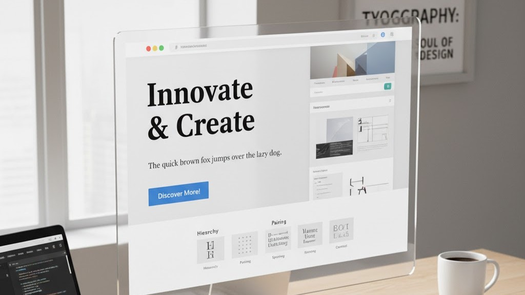
Choosing the right font is essential for strong typography in web design. Your font choice should reflect the personality and tone of your brand. A modern brand may use clean sans-serif fonts, while a traditional brand may prefer serif styles. Consistency across headers, body text, and buttons creates a professional feel. Mixing too many fonts can make your website look disorganized and confusing. Select two or three complementary fonts to maintain balance and clarity.
Font pairing also plays an important role in overall visual appeal. A strong heading font combined with an easy-reading body font creates hierarchy. Designers often choose bold and readable typefaces for headings to capture attention. Body fonts should be chosen for comfort and long reading sessions. Typography in web design becomes effective when all font choices align with your message. This balance helps visitors quickly understand your content and trust your brand.
2. Focus on Readability and Legibility
Readability is one of the most important factors in typography in web design. Users should be able to read your text without effort on any device. That means choosing fonts that maintain clarity at small and large sizes. Avoid overly decorative fonts for body text because they reduce readability. Good readability keeps users engaged and prevents frustration. It also makes your website feel clean and professional.
Legibility refers to how easily individual letters can be recognized. Proper letter spacing and consistent line height support legibility. Designers aim for spacing that separates lines without leaving awkward gaps. Balanced spacing improves the flow of text and reduces eye strain. With good legibility, your typography in web design becomes significantly more effective. It ensures every visitor can understand your message clearly.
3. Create a Strong Visual Hierarchy Using Typography
Visual hierarchy guides users through your content using size, weight, and style. Larger headings draw attention to key topics first. Subheadings help break information into manageable sections for readers. Body text supports deeper understanding and longer reading sessions. This structure makes your content easier to follow and more enjoyable. Well-planned hierarchy enhances the overall effectiveness of typography in web design.
Hierarchy also influences user behavior and engagement. Strong headings encourage readers to continue exploring your page. Highlighting keywords or phrases using bold or italic styles adds emphasis. However, these should be used carefully to avoid clutter. Balanced formatting makes text visually appealing and easy to skim. When hierarchy is clear, typography in web design becomes more functional and more impactful.
4. Use Proper Spacing to Improve Readability
Spacing affects both readability and visual comfort. Appropriate line height helps sentences feel open and breathable. Too little spacing can make your text feel cramped and overwhelming. Too much spacing can disrupt reading rhythm and cause confusion. A balanced approach supports clear content flow across all screen sizes. Spacing is a key element that strengthens typography in web design.
Letter spacing and paragraph spacing also influence overall readability. Slightly increased letter spacing can improve clarity for certain fonts. Consistent paragraph spacing separates ideas cleanly and improves visual structure. Well-spaced text encourages users to read more and stay longer on your site. Designers test spacing on multiple devices to ensure uniform results. When spacing is optimized, typography in web design becomes both beautiful and functional.
5. Choose the Right Font Sizes for Every Device
Font size greatly affects user experience. Headings should be large enough to stand out, but not too overpowering. Body text must remain readable on both mobile and desktop screens. Responsive typography scales smoothly to maintain clarity at all sizes. This ensures your content remains accessible to every visitor. Proper sizing is essential to successful typography in web design.
Using scalable units like rem or em makes resizing easier. Designers also test typography across various screen resolutions. Adjusting sizes for mobile prevents text from appearing too small or too large. Consistent sizing across elements strengthens overall visual harmony. When font sizes are optimized, users enjoy a smoother reading experience. Proper sizing ensures typography in web design looks professional everywhere.
Conclusion
Typography in web design is a powerful tool for improving readability, communication, and aesthetics. When you choose the right fonts, spacing, and hierarchy, your website becomes easier to navigate and more enjoyable to read. Strong typography builds trust and strengthens your brand identity. It also improves overall user experience on every device. Every decision you make with typography contributes to your website’s success.
Need help improving your site’s typography and design? Contact us today and let our team create a visually stunning and user-friendly website for your brand.