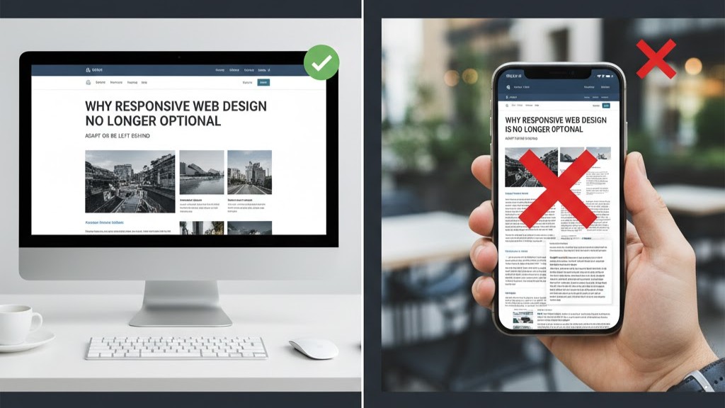
In today’s digital era, responsive web design is no longer a luxury — it’s a must-have. People browse websites using phones, tablets, laptops, and even smart TVs. A responsive design ensures your site looks perfect and functions properly on every screen. This flexibility enhances user experience and increases engagement. A non-responsive site can frustrate users and cause them to leave immediately. Let’s explore the main reasons why responsive web design is essential for modern websites.
1. Mobile Users Dominate the Internet
More than half of global web traffic now comes from mobile devices. That means your website must adapt smoothly to smaller screens. Responsive web design automatically resizes images and adjusts layouts for better readability. When users can easily scroll and navigate, they’re more likely to stay longer. Mobile-friendly websites also perform better on search engines like Google. Failing to optimize for mobile can cost you valuable visitors and conversions.
Without responsiveness, your site may appear broken or hard to use on phones. Text might be too small, images may overlap, and buttons could become unclickable. These issues frustrate visitors and reduce trust in your brand. A responsive design prevents these problems by maintaining a consistent user experience across all devices. This leads to improved engagement and customer satisfaction. Mobile-first design is now the standard, not the exception.
2. Google Prioritizes Mobile-Friendly Websites
Google now ranks websites based on their mobile versions through mobile-first indexing. That means a non-responsive design can harm your visibility online. A responsive web design ensures your site meets Google’s mobile-friendly standards. This directly improves your SEO performance and ranking potential. Search engines reward fast, accessible, and user-focused sites. If your layout adjusts smoothly, you’ll have a stronger digital presence.
When users spend more time on your site, it signals to Google that your content is valuable. Lower bounce rates and better engagement boost your SEO metrics. Responsive sites also tend to load faster, which is a key ranking factor. With a single, adaptable layout, you don’t need separate URLs for desktop and mobile. This simplifies your SEO strategy and avoids duplicate content issues. Investing in responsiveness means investing in long-term visibility.
3. Enhanced User Experience Across All Devices
User experience (UX) is at the heart of great web design. A responsive website adjusts text, images, and navigation elements automatically. This ensures users enjoy a consistent and intuitive experience across all devices. When visitors can easily find what they need, they stay longer and engage more. A positive user experience builds credibility and trust for your brand. Responsive web design transforms visitors into loyal followers.
Non-responsive layouts, however, frustrate users with misplaced buttons or cropped content. Poor readability can drive people away before they even explore your offerings. Every second of confusion can reduce conversions significantly. A well-structured, responsive website eliminates these pain points. Visitors feel comfortable and confident interacting with your site. Great UX not only satisfies users but also supports your SEO goals effectively.
4. Cost-Effective and Easier to Maintain
Managing multiple versions of a website — one for desktop and another for mobile — can waste time and money. A responsive web design uses a single adaptable layout that fits all devices. This approach simplifies maintenance, reduces costs, and ensures design consistency. You’ll only need to update one site, not two or three. Here’s why responsive web design saves you time and money:
-
Single Layout: No need to build or maintain separate versions.
-
Unified Updates: Edits, blogs, or design tweaks apply across all devices instantly.
-
Consistent Branding: Colors, fonts, and images remain uniform everywhere.
-
Simplified Analytics: You can track user data from one source instead of multiple sites.
-
Fewer Technical Issues: One layout reduces compatibility problems and broken links.
By maintaining one responsive website, you minimize effort while maximizing efficiency. It’s a long-term investment that keeps your business running smoothly. You’ll also have more control over your brand’s presentation. A responsive design gives you simplicity, consistency, and scalability without unnecessary complexity.
5. Improved Conversion Rates and Customer Retention
A responsive web design enhances usability, directly improving conversion rates. When users can easily interact with your site, they’re more likely to take action. Smooth navigation, fast loading times, and accessible CTAs make a big difference. Every frictionless interaction increases the chance of turning visitors into customers. A responsive layout builds confidence and makes purchasing or signing up effortless.
Satisfied visitors are more likely to return and recommend your website. Positive experiences lead to stronger brand loyalty and trust. On the other hand, poor responsiveness creates frustration and missed opportunities. Modern consumers expect seamless browsing no matter the device. Meeting these expectations sets you apart from competitors. Responsive web design ensures you capture and retain valuable leads effectively.
6. Future-Proofing Your Website Design
Technology evolves rapidly, and screen sizes keep changing. Responsive web design ensures your site adapts to future devices automatically. Whether users visit from smartphones, tablets, or new digital gadgets, your layout remains consistent. This adaptability protects your investment and keeps your brand looking professional. You won’t need expensive redesigns every time a new device launches.
Future-proof websites are scalable, reliable, and easy to update. As your content grows, your design will continue to perform efficiently. This approach saves resources and guarantees long-term flexibility. Responsive design isn’t just about current devices—it’s about staying ready for what’s next. Adapting early ensures your website stays modern and competitive. With responsive web design, your brand is built to last.
Conclusion
Responsive web design is essential for any business aiming to thrive online. It improves user experience, SEO, brand reputation, and cost efficiency. By ensuring your site adapts to all devices, you attract more visitors and keep them engaged. A flexible, mobile-friendly design shows professionalism and builds trust. Investing in responsiveness is the smartest move for future success.
Need help making your website fully responsive? Contact us today we’ll help you design a website that looks perfect on every screen.