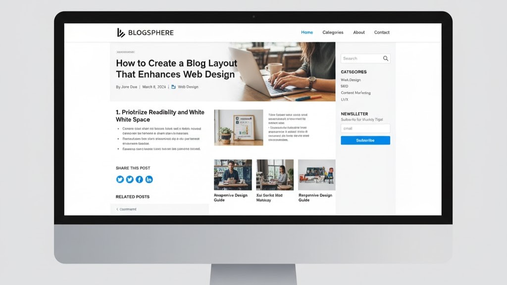
A well-structured blog layout can elevate your entire web design and make your content more engaging. Good design ensures readability, easy navigation, and consistent visual appeal. Every element—from typography to white space—affects how users experience your site. A clear structure helps readers focus on your message instead of getting distracted. When you create a blog layout that enhances web design, you strengthen both user trust and SEO performance. Let’s explore the key principles that make an effective blog layout.
1. Use a Clear and Consistent Structure
A clear structure is the foundation of good web design for blogs. Start by defining a consistent header, body, and footer section. The header should include the logo, navigation menu, and search bar for easy access. In the body, use readable fonts and clear hierarchy for titles and subheadings. The footer can feature links, contact info, and social media icons for engagement. Consistency across all pages makes users feel comfortable and confident when browsing your blog.
When structuring your blog layout, make sure your content flows logically from top to bottom. Keep paragraphs short and visually balanced for better readability. Align elements properly so text and images appear neat and professional. Avoid overcrowding the page with unnecessary widgets or ads. A clean structure helps your web design look modern and user-friendly. This enhances both usability and search engine visibility.
2. Optimize Typography for Readability
Typography is more than just choosing fonts—it’s a crucial part of web design. Select easy-to-read fonts like sans-serif styles for body text and distinctive ones for headings. Use proper line spacing and paragraph breaks to improve clarity. Font size should be large enough to read comfortably on all devices. Typography consistency throughout your site creates a professional and cohesive appearance. Good typography invites readers to stay longer on your page.
To enhance readability, use bold and italics sparingly for emphasis. Keep color contrast between text and background strong enough to avoid eye strain. Limit your site to two or three font families to maintain harmony. Typography should align with your brand’s tone and message. Well-chosen fonts contribute to a positive user experience and effective communication. When typography supports your web design, your blog becomes both functional and attractive.
3. Make Navigation Intuitive and User-Friendly
Navigation plays a huge role in web design success. A well-organized menu allows readers to find information easily. Place your main navigation bar at the top where users expect it. Include clear categories like Home, Blog, About, and Contact. Use dropdown menus if you have many topics but keep them simple. Logical navigation improves accessibility and keeps readers engaged.
In addition, add breadcrumbs to help users track their location within the site. Include internal links in blog posts to keep visitors exploring related topics. Ensure all clickable elements are easy to identify and functional on mobile devices. Avoid overwhelming users with too many links or buttons. Simplified navigation encourages longer browsing sessions and lowers bounce rates. The easier it is to explore, the more visitors enjoy your web design.
4. Balance Visual Elements and White Space
White space is not empty—it’s a design tool that enhances focus. Use it to separate sections, text, and images, creating visual breathing room. Crowded designs make reading difficult and overwhelm visitors. Balanced white space helps highlight key elements like titles, images, or CTAs. It also improves mobile responsiveness by keeping layouts uncluttered. Every part of your design should have enough space to “breathe.”
Complement white space with relevant visuals that support your content. Use images, infographics, and icons to add variety without distraction. Avoid using too many large images that slow down loading speed. Ensure every graphic aligns with your content’s tone and brand style. Visual balance builds an aesthetic that feels both modern and comfortable. A well-spaced blog layout naturally enhances your overall web design.
5. Prioritize Mobile Responsiveness
Mobile responsiveness is essential in modern web design. Most users browse blogs using smartphones, so your layout must adjust seamlessly. Use responsive grids that automatically adapt to screen size. Test your blog on various devices to ensure images and text display correctly. Navigation, buttons, and CTAs should be easily clickable on smaller screens. A responsive layout enhances both accessibility and user satisfaction.
In addition, Google ranks mobile-friendly websites higher in search results. Avoid tiny fonts or fixed-width layouts that break on mobile. Optimize images to load quickly without losing quality. Ensure that touch gestures, such as scrolling or tapping, work smoothly. Prioritizing responsiveness improves overall usability and SEO performance. A blog layout that looks great on any device reflects a well-designed and professional website.
6. Integrate Visual Hierarchy and Call-to-Action (CTA)
Visual hierarchy helps guide the reader’s attention across the page. Use headings, subheadings, and highlighted elements to structure your content. The most important information should appear first, followed by supporting details. Design CTAs like “Read More” or “Subscribe” buttons with standout colors. Contrasting tones help them grab attention without clashing with the design. This approach ensures users naturally follow your intended reading path.
Effective CTAs are clear, concise, and placed strategically throughout the layout. Position one near the top and another at the end of each post. Avoid overusing them—quality placement works better than quantity. Test button colors and wording to see what drives engagement. A strong hierarchy paired with smart CTAs keeps readers interested and active. Together, they create a blog layout that enhances both function and beauty in web design.
Conclusion
Creating a blog layout that enhances web design takes planning and precision. Focus on structure, typography, navigation, white space, and responsiveness. Combine aesthetics with usability to engage readers and strengthen your site’s brand. When users find your layout visually pleasing and easy to navigate, they’re more likely to return. Every design decision contributes to better user experience and SEO results.
Need professional help improving your web design? Contact us today to discuss how we can build a stunning, user-friendly blog for your website.. Our expert web design team can help you create a site that’s not only beautiful but built on solid scientific principles. Let’s make your digital presence unforgettable.